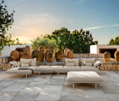
Past, present and future collide in this exceptional residence, transformed from two apartments (originally built in 2001) into a three-storey family home. Melbourne-based Jolson Architecture and Interiors cleverly reimagined the dated spaces with a complete structural overhaul, opening up the floorplan to make the most of the site’s beautiful Bayside location via natural light and a vision to maximise the views.
That said, the building’s original inverted arch facade was one of the few design features that was retained, and its influence can be seen strongly in the look and feel of the finished renovation.
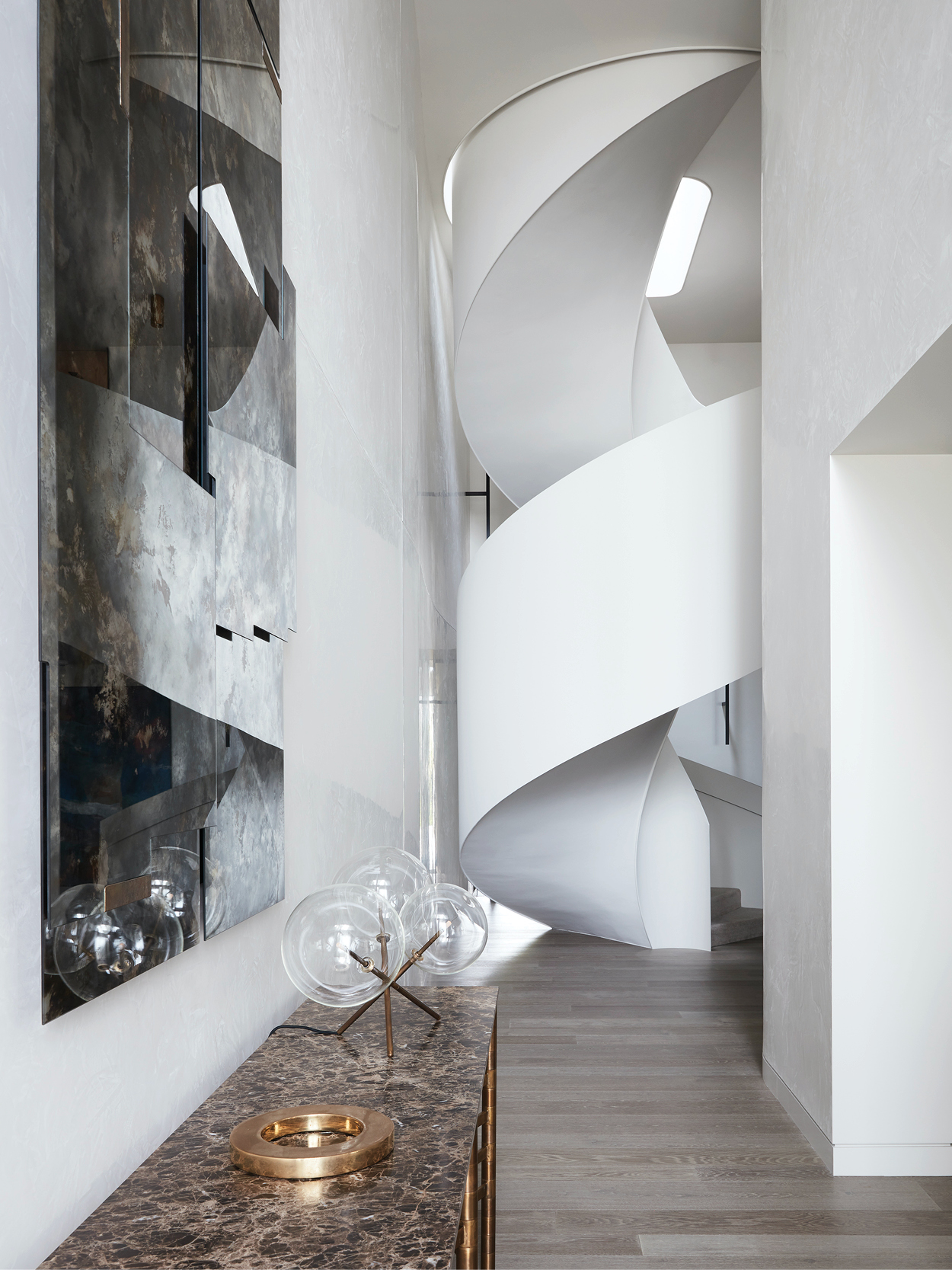
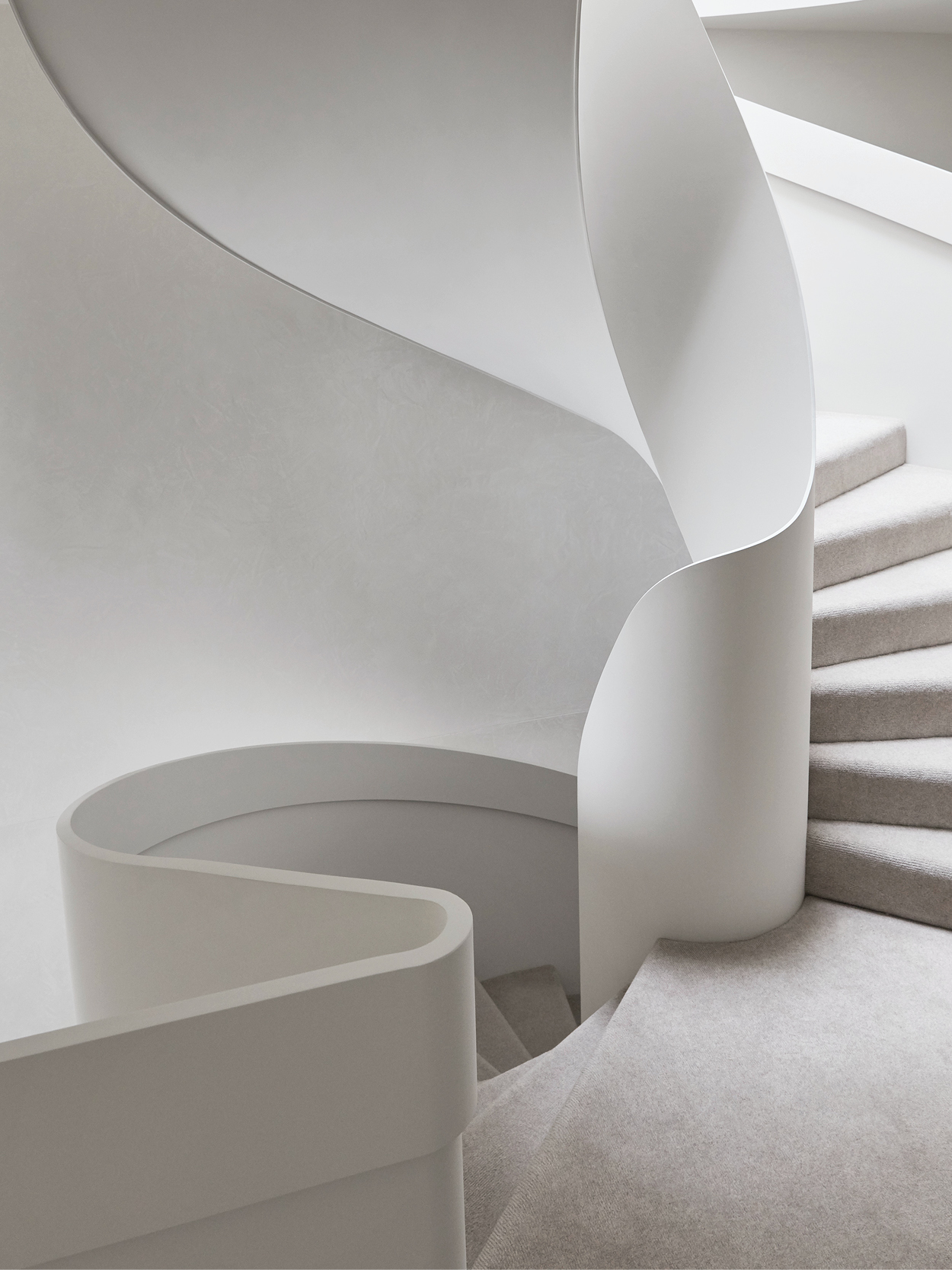
From this exterior arch, a motif of movement continues throughout the residence, where gently-undulating walls, a circular skylight and rounded furnishings build to a crescendo in the curved, central staircase. Rising through a seven-metre void that cuts through the middle of the building, this staircase truly is a work of art — sensual, sculptural and designed in such a way that it would look altogether at home in a gallery.
Made from steel and encased in a reflective, polished plaster finish, this staircase sets an unapologetic tone for the rest of the home, which, despite its simple palette, offers up a number of bold, statement-making moments (from the tactile art to the double-height front door).
The team at Jolson met the clients’ brief by arranging the spaces of the home so that the family were afforded as many opportunities to indulge in moments alone, as they could relish in time spent together. Inside, most of the bedrooms can be found on level one, while the master suite takes up level two and the communal living and dining spaces are positioned on level three — a split that ensures the shared spaces receive the full effect of the home’s enviable views, while the private ones benefit from a more quiet, calm atmosphere.
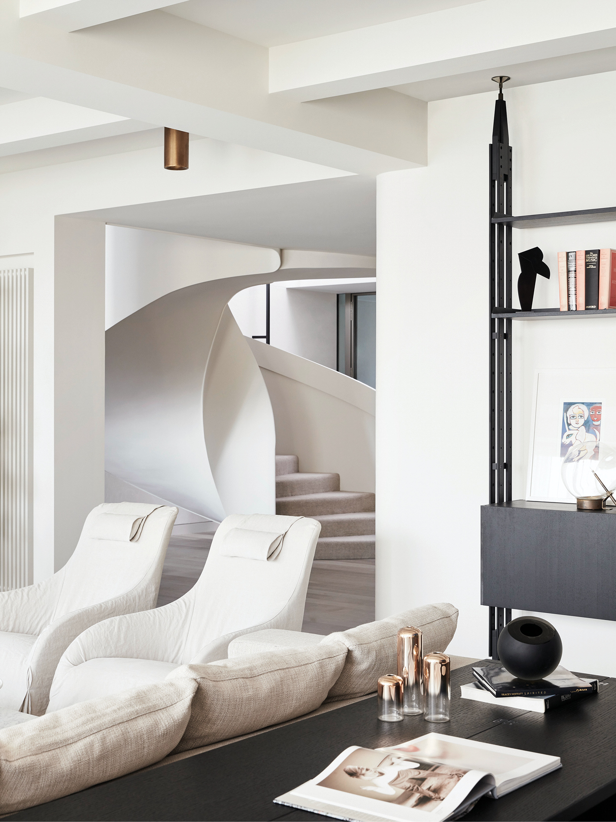
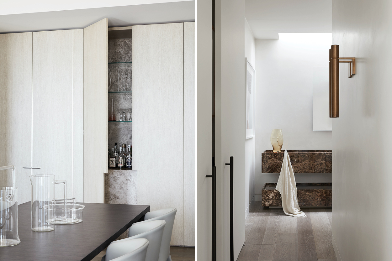
That said, the idea of ‘calmness’ really is carried throughout the entire residence, with Jolson utilising a deliberately restrained, neutral palette to provide the perfect canvas on which to layer detailed joinery and high-quality materials.
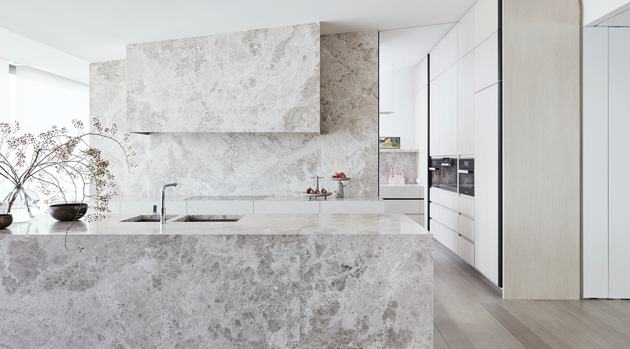
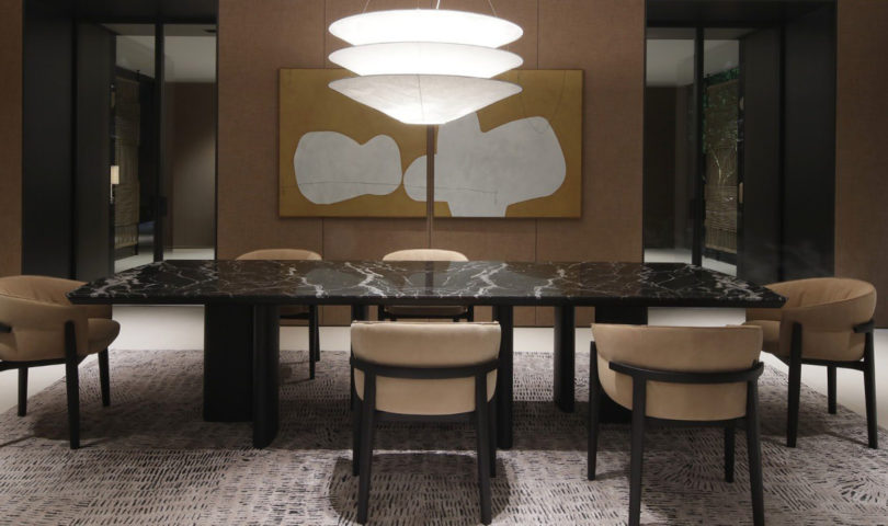
From the stone benchtops and splashbacks to the eye-catching brass accents, to the recurring leathered marble and the American oak floors, the finishes deliver a sense of warmth in the way they feel almost handcrafted, and work together to give the overt simplicity of this house a spectacular sense of depth.
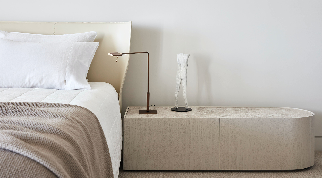
Poetic, playful and design-focused without ever losing sight of crucial functionality, stepping into this home is like walking into a gentle, enveloping hug.
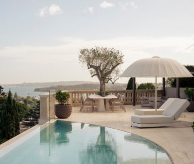
It is a place in which there is ample space to breathe and take in one’s surroundings, without losing its refined, architectural quality. Jolson has managed to adhere to the clients’ family brief while still paying homage to the original building and establishing a much stronger relationship between the structure and its Bayside location — creating a forward-looking home that doesn’t shy away from its past.
Image credit: Lucas Allen
